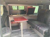
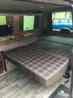
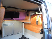
So my van is black and will have a blue stripe or accent somewhere on the outside, something like this but probably less stripes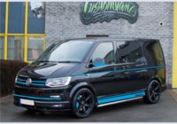
My question is how not make a huge mistake and get the units etc wrong and you can't live with it.
I am having this built shortly and I am just choosing colour for the interior finishes.
I am currently thinking of:
mid grey leather for seats and RnR bed with a blue stitching to bring the colour through
pale grey blue flecked floor
a pale cream ivory for the units with a darker edge banding
a dark ish wood effect worktop
Blinds a slate grey
Splash back and window / blind surrounds in the above blue
a pale grey carpet for the walls.
I am worried this is all a bit drab but I want calm not garish
Its personal taste but I'd like to hear about any tips or mistakes people have made or what you would do differently if you did it again?
I want a light airy space but also practical.

