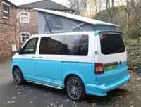
Two tone with barn doors - where to split?

Andysmee

Previously the last of the TSI's
Moderator
VIP Member
T6 Legend
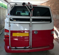
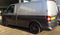
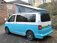
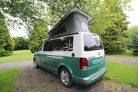
I've been looking into how people deal with the problem of two tone paintwork/wrap when you have barn doors. With a tailgate it's easy, and there's a natural line that is pleasing to look at, but I'm not 100% on the normal approach to barn doors - to split at the top of the tail lights, or thereabouts.
wandahome-westfalia-kepler-iconic-pop-top.jpg

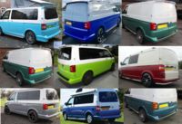
I've gathered a few, and mocked up a couple of ideas. What do you think? and show us your two tone barn doors, please!
1602663328055.png
 
I prefer the ones that follow the line of the lights down then go straight across to include the handle (like the lime green)
 
Last edited:
I've been looking into how people deal with the problem of two tone paintwork/wrap when you have barn doors. With a tailgate it's easy, and there's a natural line that is pleasing to look at, but I'm not 100% on the normal approach to barn doors - to split at the top of the tail lights, or thereabouts.


I've gathered a few, and mocked up a couple of ideas. What do you think? and show us your two tone barn doors, please!


View attachment 88127

If you’re looking at it like a keypad, no.4 for me looks best.
 
I quite like the bottom middle but prior to seeing that would have gone for straight across at the bottom of the curve of the tail lights. Essentially, so long as it carries on some lines that are already on the van it will look good.
 
It's tricky with the barn door not having an obvious swage line, but I agree with @Loz on this one, the lime green one looks best.
 
1602677344685.png
There's a limit because of the badge when you go that direction, but it can be done better than this one!
 
Baby blue top left for me - just follow the line around or just a slight drop so there is a straight line between the edge of the lights.
 
There's a limit because of the badge when you go that direction, but it can be done better than this one!
That’s why I like no3/no4/no9 (but 4 for colour-coding).
Straight through the middle of the badge.
 
View attachment 88142
There's a limit because of the badge when you go that direction, but it can be done better than this one!
Looking at it again, I think there's enough room to clear the top of the badge and still have the line on the radius of the rear lights where the top diagonal line of the lights meets the vertical. As long as the split line isn't obviously half way up the diagonal top line of the lights it would work.
 
Mine is the same as top-left, but if I had the option I would have chosen andysmee's line.
 
Looking at it again, I think there's enough room to clear the top of the badge and still have the line on the radius of the rear lights where the top diagonal line of the lights meets the vertical. As long as the split line isn't obviously half way up the diagonal top line of the lights it would work.
I think that's what they've done on no. 2, but not colour coded the trim
 
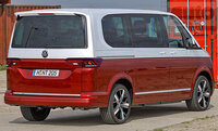
The T7 two tone tailgate looks to be following the lights, not the handle:

vw-t7-2021-02_0.jpg
 
Mine is the same as top-left, but if I had the option I would have chosen andysmee's line.
So, something like this:
baby blue two tone adjustment.png
or maybe: (blue, chrome, unpainted)
baby blue two tone adjustment - blue.pngbaby blue two tone adjustment - chrome.pngbaby blue two tone adjustment - rubber.png

Anyone who hasn't paid for a two tone paint job, or wrap, might not understand why I'm spending so much time now on this! The factory option was £2.5k+
 
Last edited:
So, something like this:
View attachment 88209
or maybe: (blue, chrome, unpainted)
View attachment 88210View attachment 88211View attachment 88212

Anyone who hasn't paid for a two tone paint job, or wrap, might not understand why I'm spending so much time now on this! The factory option was £2.5k+

Thats a lot of masking tape :-0

I prefer the top picture with the white trim over the number plate - the others look fussy and attract attention whereas the top one just looks right! All IMHO!!

Ian
 
I liked the way the trim and the badge define the line, so I may go with chrome trim. I'm aiming for a high key look, like a caravelle, so would suit to add that element on mine
 
What colour are you considering? I chose VW teal blue - a current colour used on the Up!
 
Back
Top