You are using an out of date browser. It may not display this or other websites correctly.
You should upgrade or use an alternative browser.
You should upgrade or use an alternative browser.
T7 Multivan
- Thread starter WheelieBealie
- Start date
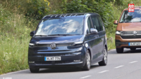
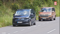
That is not a good looking van. Someone @ VW needs shooting for signing that design off.
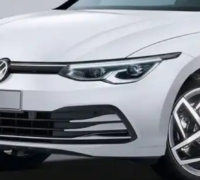
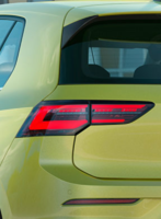
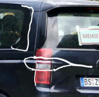
If you're still looking at that boring one look closely and you'll see that everything on the vehicle is covered with vinyl pictures of other things. Look for the shut lines around the front lights and rear lights for example:That is not a good looking van. Someone @ VW needs shooting for signing that design off.
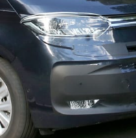
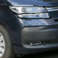
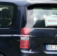
Last edited:
Good point it looks like the magazine has not done a very good job with their assumptionsSo where are the air entry points for the radiators, there is very little grill area?
Very well spotted @Andysmee although I still can’t see it making too much difference to the overall asthetics of the T7.If you're still looking at that boring one look closely and you'll see that everything on the vehicle is covered with vinyl pictures of other things. Look for the shut lines around the front lights and rear lights for example:
View attachment 93898
View attachment 93899
More deets......
T7 ?

 www.thedrive.com
T7 ?

Watch VW’s New Transporter Van Go Full Send at the Nurburgring
It's, uh, expedited durability testing. Definitely not messing around.
Last edited:
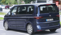
Still don’t like it.Stickers removed: So kommt der neue VW T7
No, the stuck on vinyl pictures that showed light clusters like a Sharan's.I assume by 'stickers' you mean the black and white camo job and I think I preferred it like that - at least then the looks of the thing were obscured, if only a little
Also a rumour that this will run alongside the T6.1, as a Multivan, so may not be a California of this model. But that's not substantiated
It's still got a face that only a Mother could love.It should keep all the members with severe ride height OCD happy as it appears to be running lower than a T6.
A mother with seriously impaired eyesight!!It's still got a face that only a Mother could love.
 Love is blind... but give me 20:20 vision any day!!
Still a Sharan, not a T7. Very sloppy reporting by Auto Bild.Still don’t like it.
Yep, its a Sharan, the new T7 wont be out for about 4 years.
Similar threads
- Replies
- 485
- Views
- 66K
- Replies
- 12
- Views
- 2K
- Replies
- 56
- Views
- 10K
- Replies
- 188
- Views
- 14K


