It's been a bit slow but finally got around testing plotting directly with Python and matplotlib library without R. Thanks for the tip regarding more than two axes @ebiii !
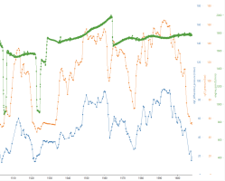
So, here's the above plot having everything in single plot instead of piling them up vertically.

And for anyone interested, here's the corresponding Python code:
So, here's the above plot having everything in single plot instead of piling them up vertically.
- Saves space
- Can get confusing with many signals
- Can't really use horizontal grid lines (or at least should use on main axis only)
- Discrete signals by scale + offset, no need for axis
- Although perhaps more confusing than piled style, there's still value as usually the danger of misinterpretation is low

And for anyone interested, here's the corresponding Python code:
Python:
import numpy as np
import pandas
import matplotlib.pyplot as plt
from mpl_toolkits.axes_grid1 import host_subplot
import mpl_toolkits.axisartist as AA

coasting = pandas.read_csv("hot.ChannelGroup_0_CAN1_-_message_dsg_10hz_0x359.csv")
speed = pandas.read_csv("hot.ChannelGroup_1_CAN1_-_message_kombi_1_40hz_0x320.csv")
ambient_temperature = pandas.read_csv("hot.ChannelGroup_2_CAN1_-_message_mfd_50hz_0x527.csv")
oil_temperature = pandas.read_csv("hot.ChannelGroup_3_CAN2_-_message_engine_7_50hz_0x588.csv")

df = pandas.merge(
    pandas.merge(coasting, speed, on = 'timestamps'),
    pandas.merge(ambient_temperature, oil_temperature, on = 'timestamps'),
    on = 'timestamps'
)
df.rename(inplace = True, columns={
    "CAN1.dsg_10hz.coasting": "coasting",
    "CAN1.kombi_1_40hz.kombi_speed_actual": "speed",
    "CAN1.mfd_50hz.ambient_temperature": "ambient_temperature",
    "CAN2.engine_7_50hz.oil_temperature": "oil_temperature"
})

# Scale + offset coasting to main axis
df['coasting'] = df['coasting'] * 5 + 5

print(df)

fig = plt.figure()
plt.subplots_adjust(right = 0.75)

color = 'tab:blue'
r1c1ax1 = host_subplot(111, axes_class = AA.Axes)
r1c1ax1.set_xlabel('Time (s)')
r1c1ax1.set_ylabel('Speed [km/h]', color=color)
r1c1ax1.plot(df['timestamps'], df['speed'], color=color, label = 'Speed')
r1c1ax1.plot(df['timestamps'], df['coasting'], color='tab:gray', label = 'Coasting')
r1c1ax1.tick_params(axis='y', labelcolor=color)
r1c1ax1.set(ylim = (0, 130))
r1c1ax1.set_xticks(np.arange(0, 2200, 120))
r1c1ax1.grid(axis = 'x')

color = 'tab:green'
r1c1ax2 = r1c1ax1.twinx()
r1c1ax2.axis["right"].toggle(all=True)
r1c1ax2.set_ylabel('Ambient temperature [°C]', color=color)
r1c1ax2.plot(df['timestamps'], df['ambient_temperature'], color=color, label = 'Ambient temperature')
r1c1ax2.tick_params(axis='y', labelcolor=color)
r1c1ax2.set(ylim = (20, 50))

color = 'tab:red'
r1c1ax3 = r1c1ax1.twinx()
r1c1ax3.axis["right"].toggle(all=True)
r1c1ax3.axis['right'] = r1c1ax3.new_fixed_axis(loc = 'right', offset = (60, 0))
r1c1ax3.set_ylabel('Oil temperature [°C]', color=color)
r1c1ax3.plot(df['timestamps'], df['oil_temperature'], color=color, label = 'Oil temperature')
r1c1ax3.tick_params(axis='y', labelcolor=color)
r1c1ax3.set(ylim = (0, 120))

r1c1ax1.legend()
fig.tight_layout()
plt.show()
